
So, with the cutting off of the excess sleeve from Chemise #1, I couldn't bear to let that ruffled edge be tossed. So I resolved to re-utilize them, and the thing that came to mind was to embroider on the odd, angle-y piece and make it look like an intentional insert.I think this will be super cute for the Shepherdess outfit, so I'll have to do some pondering there. The 18th c. was renowned for having very wide, exposing necklines... which I'm not interested in doing, so what to use instead, which will look "correct" with the rest of the outfit is a question.

I cut a body somewhat similar to the original Chemise #1, but with a bit more roominess. Then I will attach the sleeves once I am certain their embroidery is done, and afterward I'll figure out what to do with the neck-line/collar area.
If I end up with any sort of collar, etc, I may do some embroidery on that as well... but it's not decided yet.

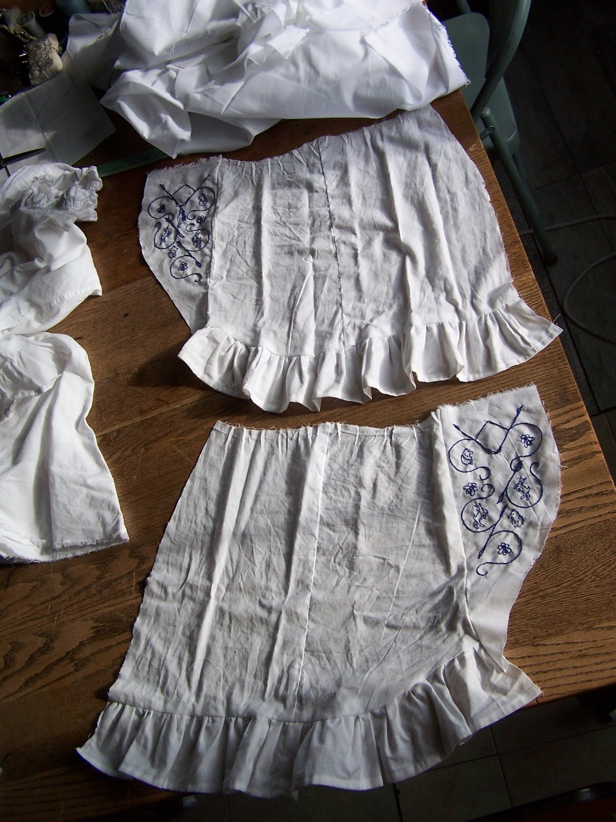
I like the look of Elizabethan era "black work", or sometimes when done in red it's called "red work". But I don't like black or red all that well, so I resolved to make some "blue work". ;-) I drafted up the pattern by stages, applying the steps one at a time as I decided on them.
Of the two general styles of black-work, most is rather 'cross-hatch-y' and geometric, but there are examples that are more "scroll work-ish". I like that better, so went with that for my main pattern.
Then I drew up the bees on honeycomb, the Belgian Tervuren heads, and the dancing kid goats, and put them in as I finished with their concepts.

I plopped the horse in the middle at the end, but now I'm reconsidering. Does it make the look "too busy"? I don't like how the horse turned out, and would be okay with tearing it back out if that was the best decision.
On the one hand it would save having to make a matching one for the other sleeve, and slot that time toward something else!

Vote now! Which do you think?
Left... or Right is better?I need to poll the audience!!!
11 comments:
Left! I love the horse ;D
Both are beautiful! My mom and I prefer the right, the one without the horse, because we think the horse does make it a little too busy and doesn't quite fit in with the other animals. But the horse is really cool, so I don't think putting it in would be amiss either. :) If you decide not to keep the horse, you should embroider it on something else!
But you know what, the more I look at it, the more I like the horse there... Hmm... I can see why you're having trouble deciding! Since these are sleeves, they're not front and center, so either way is going to look great.
Thanks for helping out, girls!!! I appreciate your thoughts!
And so far it looks like the horse is winning!!! ;-) Thanks keturah for making that a clear vote from you!!
And Kelsey, thanks for getting your mom in on it too... I agree with what you're both thinking! Though, on the other hand, I agree with your other hand, also.
And yes, that's why I need help deciding!!! :-)
Hopefully we'll get lots more votes, so the choice becomes clear!!!
Hard to pick, but I think I prefer the horse one slightly more.
I like the horse. I like the little goaties even more, but they are on both sleeves already so I don't have to vote about that. :)
I vote left. The horse is nice, but looks kind of squeezed in there & not spaced as nicely as the horse-less sleeve. Beautiful work!
Thanks, Brie, for making the hard choice and picking a vote!!!
And Linda, so glad you love the little goats!! :-) I super appreciate that!!!
And okay, that's another vote for the horse!!!
Karley, yes I agree. If I were to do it over, I probably could have spaced the components with the intent to add the middle row of motifs. As it was, this is sort of an add-on, and I guess the question is: does the appeal of the horse outweigh the slight awkwardness of design?
The people's choice will decide that!!!
Thanks so much for chiming in, ladies, I really appreciate it!!! If we get more votes, we'll soon know the final answer!!! :-)
The horse is amazing! How did you do it so small and detailed, and at that front angle? Amazing!
My two pence: it does look a *little* squished — would you consider trying a daisy or something on the right sleeve just to see how that compares? Something small that just says ‘this space is finished’ and sets off all the other detail you’ve meticulously put into the design? (Prancing baby goats <3)
Hey, thanks for the compliment on the horse! Like most artists, I can mostly see it's problems, so thanks for the detailed compliment!
I know, the spacing isn't great... I'd planned it without, then thought it was too open and added the horse, then thought THAT was too crowded, and so was about to rip it back out! Then I thought "Wait! Ask other people's opinions first!"
So I did. ;-)
A small something is an option... though the horse is already there, so possession of a space is nine-tenths of the law, right?
Also, a lady (who made me laugh!) on FB said "18th cen. style: There is no such thing as too crowded!"
In future, I'll hope to plan the spacing better. <3
All righty!!
As a wrap up, the horse definitely won out on the votes!
So we'll be going with a horse on the other sleeve, (though I may change the look of that horse) And Perhaps, to keep the pattern from looking imbalanced, we should add a little more detail in other areas, so there's not this open scroll-work, and then pop, tight detail only in the middle.
I'll be thinking about that!
Again, thanks for helping out by sharing your opinions, everyone! It really took a load off my already frazzled mind!
Post a Comment